


Introducing Scatter Plots
Posted on May 26, 2020 by Admin
Hello readers! We hope you are doing well, and thank you for your continued support of SimplyAnalytics. We are excited to announce that scatterplots are officially live! Scatter plots are a great way to visualize the relationship between two different data variables, and we know you will enjoy them as much as we do.
Let’s take an in-depth look at this new feature.
What is a scatter plot?
A scatter plot is a graphical representation where the values of two data variables are plotted along the x and y axis. Each dot represents both the x and y values for a single location, such as a ZIP Code or county.
Why use a scatter plot?
Scatter plots enable users to identify correlations between two different variables. Let’s take a look at an example below using SimplyAnalytics where we’ll use the % of Adults (25+) with a college degree and Median Household Income to see if there’s a correlation between the variables for Counties in the USA.
Getting Started
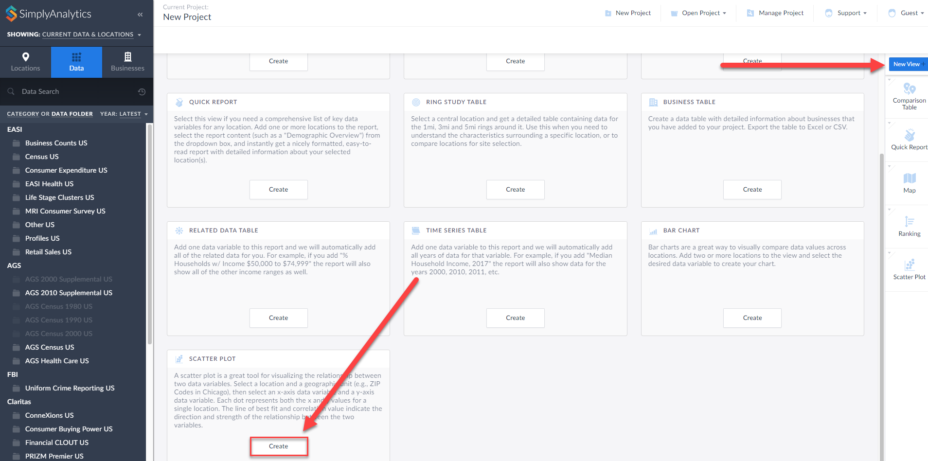
First, click on New View > Create under the Scatter plot option:
The Edit View page displays your data variables and locations in the project.
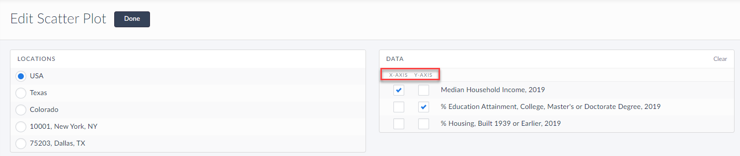
Here you can choose which data variables to display along which axis. Of course, this can be edited directly on the scatter plot as well, but for now, select Done to generate the scatter plot.
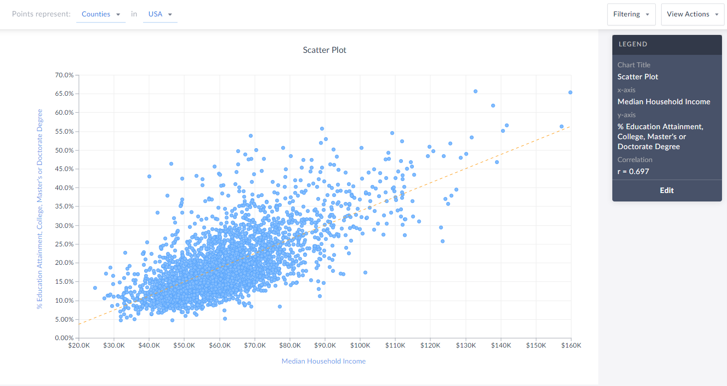
Voila! Your first scatter plot is created. Now, what exactly is this showing?
The top of the view explains what each point represents - in this example, Counties in the USA. The legend towards the right also displays helpful information.
TIP: You can click on any point to display the name and underlying data.
Interpreting Your Scatter Plot
Looking at this scatter plot, there is a strong positive correlation between median household income and the % of adults who have a college degree within CDs in the USA.
The legend has a section heading titled Correlation that contains an “r” value. What does the r-value mean? In short, that’s displaying Pearson’s R - this is a correlation coefficient that’s used in linear regression. The “r” value will always be on a scale from -1 to +1, and you can use these values to understand the relationship between the variables.
A generalization of the scales and how to think of them is:
Positive Direction - The points looks like they are going uphill
1 - perfect correlation
0.75 to 1 - very strong correlation
0.5 to 0.75 - moderate correlation
0.25 - 0.5 - weak correlation
Less than 0.25 - none/no correlation
Negative Direction - The points looks like they are going downhill
-1 - perfect correlation
-0.75 to -1 - very strong correlation
-0.5 to -0.75 - moderate correlation
-0.25 to -0.5 - weak correlation
Less than -0.25 - none/no correlation
The scatter plot above has an r value of 0.697. This means there is a moderate, positive correlation. Does a negative direction/value mean anything bad or wrong? Nope! It just means as the x axis increases, the y axis decreases - nothing negative or incorrect.
Editing Your Scatter Plot
Renaming
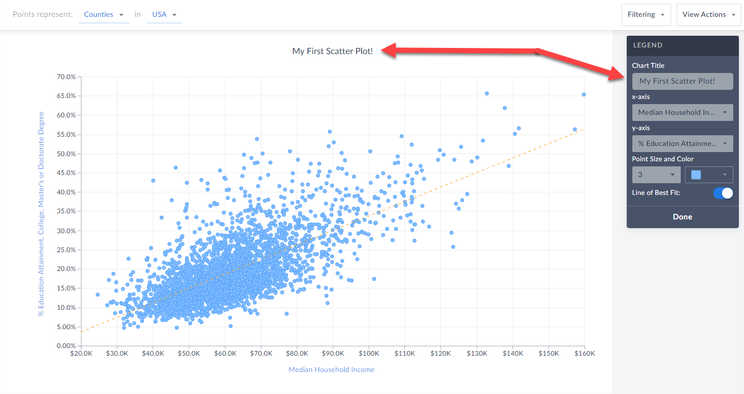
You can rename your scatter plot by either clicking on the heading at the top of the graphic, or by selecting Edit on the legend and renaming there.
 Changing Variables
You are welcome to select either axis in the legend, and change the variable(s) you want to analyze.
Changing Point Size and Color
Feel free to edit these options within the Edit Legend page to change the appearance of your graphic.
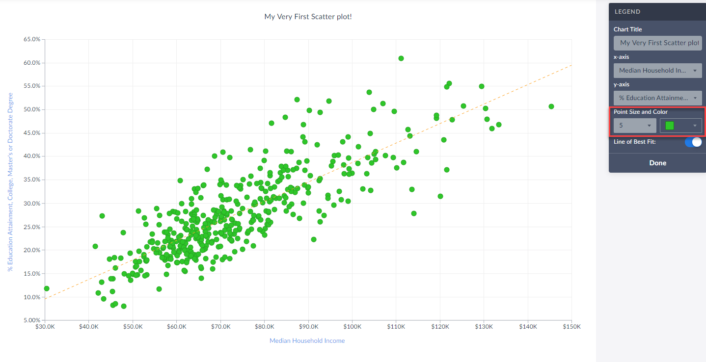
Toggle Off/On the Line of Best Fit
Use this button to toggle between whether or not the line of best fit is present. What is the line of best fit? In short, it is a straight line that best represents the data on a scatter plot.
Advanced
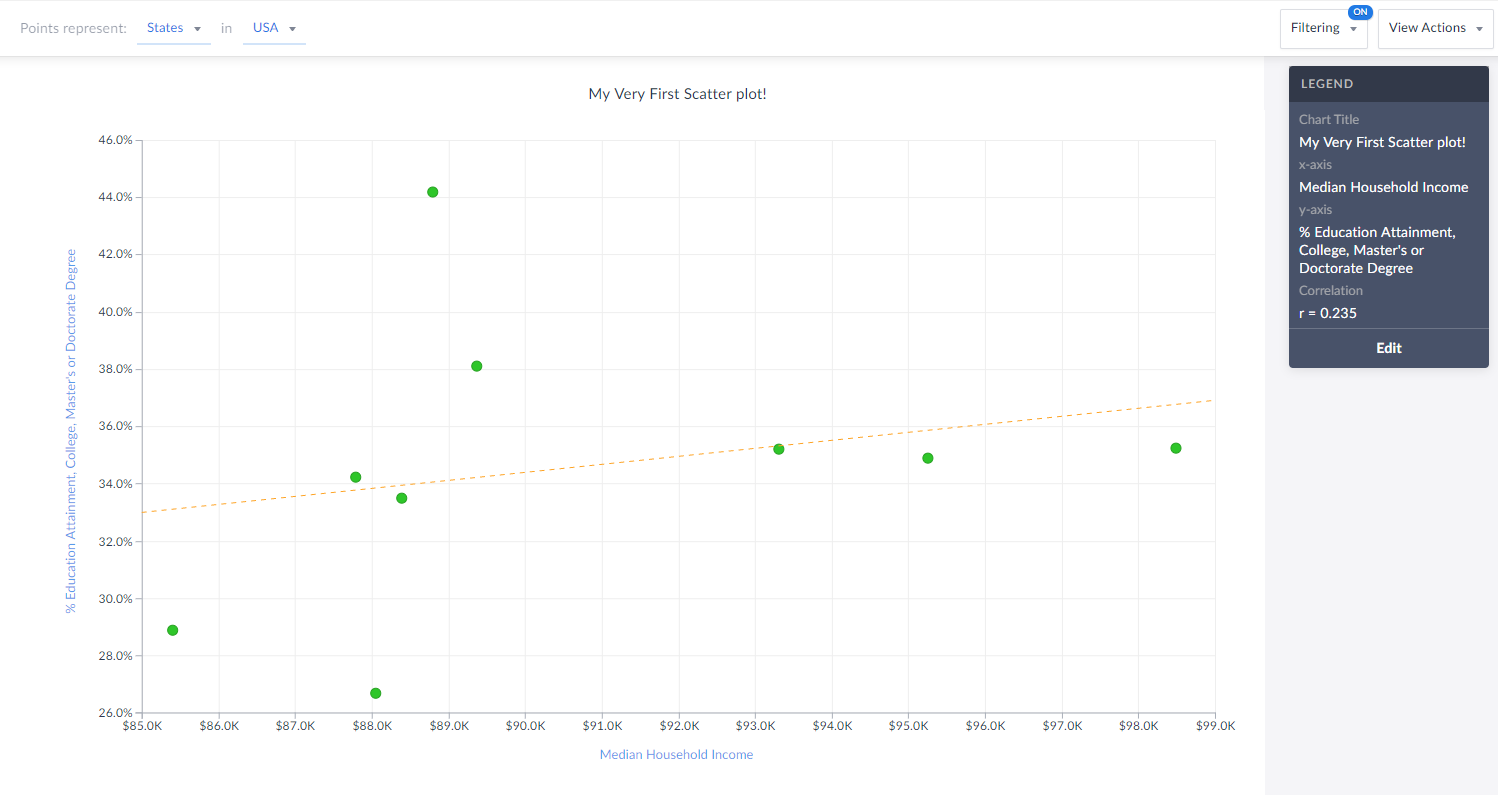
Lastly, you are welcome to create and apply a data filter onto your scatter plot. This will remove any points that do not meet your filter conditions. The image below would normally display all States in the USA, however, there is a median hh income filter applied (inc > $85,000) so you are left with only 9 states (dots) in the chart that meet this criteria.
Also notice how the x-axis has moved to reflect our criteria.
That’s all for today! We’re excited to see some of the interesting scatter plots you can come up with!
Stay safe everyone, and as always, you can access SimplyAnalytics remotely, so please let us know if you are running into any issues with remote access - we are here to help and always available for webinar training sessions.
More from SimplyAnalytics
Posted on Apr 01, 2014 by Admin
Another fantastic series of workshops and events are planned at the SLA Conference on June 8-10th, 2014. Register now for networking and workshops throughout the week. Over 200 events are...
Posted on Feb 27, 2009 by Admin
Geographic Research, Inc. is pleased to participate in the Statewide California Electronic Library Consortium's (SCELC) 12th Annual Vendor Day. SCELC members and librarians from other aca...
Posted on Sep 21, 2009 by Admin
The North Carolina Library Association will hold its annual conference in Greenville, NC at the Greenville Convention Center from October 6-8, 2009. Geographic Research, Inc. will be exhi...
Posted on Feb 26, 2014 by Admin
The Statewide California Electronic Library Consortium is holding another packed week of workshops and networking during the SCELCapalooza event in March 2014. Geographic Research will b...
Posted on May 06, 2013 by Admin
The GRI team is looking forward to exhibiting at SLA 2013 at the San Diego Convention Center, June 9th through the 11th. The Special Libraries Association (SLA) is a nonprofit global orga...
Posted on Jun 08, 2023 by Admin
We are excited to announce Mansi Nishit Trivedi as the winner of the 2023 BRASS Student Travel Award sponsored by SimplyAnalytics! Mansi, a Master of Information student at Dalhousie, has...
Posted on May 23, 2019 by Admin
Come visit the SimplyAnalytics team at the Special Library Association's Annual Conference in Cleveland. Special librarians and other information professionals come together at SLA’s annu...
Posted on Nov 29, 2009 by Admin
Legal Information Alert, a monthly newsletter covering what's new in legal publications, databases and research techniques, published a review of SimplyMap in their April 2009 issue title...
Posted on Dec 11, 2015 by Admin
With the final week of the college football season in the books, and bowl game selections having just taken place, we wanted to search within SimplyMap to see if any data pertaining to co...
Posted on Jul 20, 2020 by Admin
Hello readers! We hope you are doing well and staying safe. Today we are excited to introduce the Simmons NCS crosstabs functionality! This is a feature we’ve been working on for a while,...