


Introducing Histograms to SimplyAnalytics
Posted on Sep 14, 2021 by Admin
Welcome readers! Today we are excited to welcome histograms to SimplyAnalytics. We hope you enjoy this wonderful new visualization as much as we do. Let’s take a look.
What is a histogram?
In short, a histogram is similar to a bar chart, but instead groups values into ranges (referred to as “bins”). The height of each bar displays how many values fall within that bin.
Example
Let’s take a look at an easy to read example. The histogram view can be found under New View > Histogram in the program. The example below is showing the % of adults (pop 25+) with a bachelor’s degree or higher in States in the USA.
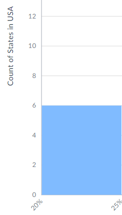
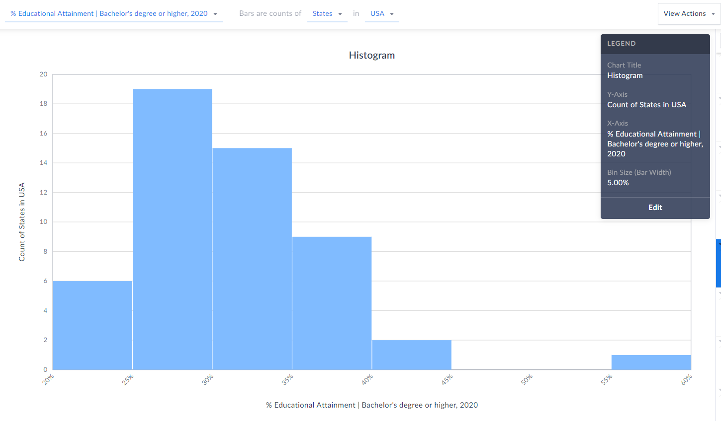 Each bin size, or bar width along the X axis represents a 5% range - so, 20-25%, 25-30%, etc. (zoomed in below)
 The height of each bin represents how many states fall within that bin/range. The example here means that 6 states in the USA have between 20-25% of the adult population who have a bachelor’s degree or higher.
 TIP: Reference the legend on your screen to help interpret the visualization.
Notice towards the far-right of our histogram there does seem to be a potential outlier in the data - there is 1 state where 55-60% of the population 25 and above have at least a bachelor’s degree! Can you guess what state that is?
Answer/Bonus Tip: Towards the top-right of your histogram, click on View Actions > Create Data Table.
TIP: Reference the legend on your screen to help interpret the visualization.
Notice towards the far-right of our histogram there does seem to be a potential outlier in the data - there is 1 state where 55-60% of the population 25 and above have at least a bachelor’s degree! Can you guess what state that is?
Answer/Bonus Tip: Towards the top-right of your histogram, click on View Actions > Create Data Table.
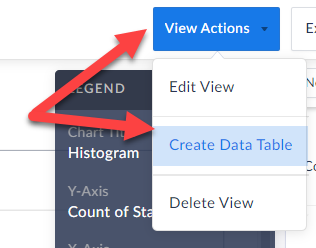 This will generate a Ranking Report for you, and you can quickly sort to find out the answer here…...drum roll…...it’s the District of Columbia, with a value of 57.15% - the lone state within that bin mentioned above.
Last Note: You can edit the color of the bars, title and bin sizes of your histogram by clicking Edit on the Legend.
This will generate a Ranking Report for you, and you can quickly sort to find out the answer here…...drum roll…...it’s the District of Columbia, with a value of 57.15% - the lone state within that bin mentioned above.
Last Note: You can edit the color of the bars, title and bin sizes of your histogram by clicking Edit on the Legend. 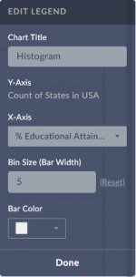 Feel free to make any changes here, and your histogram will automatically be updated.
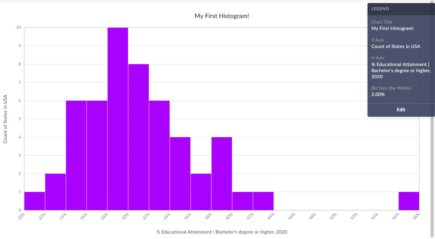
Check out our final histogram below with new colored bins, bin sizes set to 2% instead of 5%, and title.
As always, you are welcome to export your work by clicking on the Export button towards the top-right of the screen.
Feel free to make any changes here, and your histogram will automatically be updated.
Check out our final histogram below with new colored bins, bin sizes set to 2% instead of 5%, and title.
As always, you are welcome to export your work by clicking on the Export button towards the top-right of the screen.
 We hope you enjoy this new visualization! Feel free to contact us at anytime by emailing support@simplyanalytics.com
Each bin size, or bar width along the X axis represents a 5% range - so, 20-25%, 25-30%, etc. (zoomed in below)
 The height of each bin represents how many states fall within that bin/range. The example here means that 6 states in the USA have between 20-25% of the adult population who have a bachelor’s degree or higher.
TIP: Reference the legend on your screen to help interpret the visualization.
Notice towards the far-right of our histogram there does seem to be a potential outlier in the data - there is 1 state where 55-60% of the population 25 and above have at least a bachelor’s degree! Can you guess what state that is?
Answer/Bonus Tip: Towards the top-right of your histogram, click on View Actions > Create Data Table.
This will generate a Ranking Report for you, and you can quickly sort to find out the answer here…...drum roll…...it’s the District of Columbia, with a value of 57.15% - the lone state within that bin mentioned above.
Last Note: You can edit the color of the bars, title and bin sizes of your histogram by clicking Edit on the Legend. Feel free to make any changes here, and your histogram will automatically be updated.
Check out our final histogram below with new colored bins, bin sizes set to 2% instead of 5%, and title.
As always, you are welcome to export your work by clicking on the Export button towards the top-right of the screen.
We hope you enjoy this new visualization! Feel free to contact us at anytime by emailing support@simplyanalytics.com
The height of each bin represents how many states fall within that bin/range. The example here means that 6 states in the USA have between 20-25% of the adult population who have a bachelor’s degree or higher.
TIP: Reference the legend on your screen to help interpret the visualization.
Notice towards the far-right of our histogram there does seem to be a potential outlier in the data - there is 1 state where 55-60% of the population 25 and above have at least a bachelor’s degree! Can you guess what state that is?
Answer/Bonus Tip: Towards the top-right of your histogram, click on View Actions > Create Data Table.
This will generate a Ranking Report for you, and you can quickly sort to find out the answer here…...drum roll…...it’s the District of Columbia, with a value of 57.15% - the lone state within that bin mentioned above.
Last Note: You can edit the color of the bars, title and bin sizes of your histogram by clicking Edit on the Legend. Feel free to make any changes here, and your histogram will automatically be updated.
Check out our final histogram below with new colored bins, bin sizes set to 2% instead of 5%, and title.
As always, you are welcome to export your work by clicking on the Export button towards the top-right of the screen.
We hope you enjoy this new visualization! Feel free to contact us at anytime by emailing support@simplyanalytics.com
More from SimplyAnalytics
Posted on Oct 07, 2024 by Admin
We're headed to Charleston! Come visit the SimplyAnalytics team on November 12th at the Gaillard Center at booth 41. We'll be doing live demonstrations of the database, answering question...
Posted on Feb 02, 2024 by Admin
We are excited to be back exhibiting at PLA this April in Columbus, OH. Join us at Booth #2631 to discover how SimplyAnalytics can help libraries understand their service area, assist sma...
Posted on Jun 02, 2017 by Admin
We can't wait for ALA Annual this Summer, and the opportunity to share SimplyAnalytics with the ALA community. Stop by the SimplyAnalytics booth (1339) and take a peak at what we've been ...
Posted on Aug 30, 2009 by Admin
Jeff Zaslow, Wall Street Journal columnist and co-author of the The Last Lecture, will speak at the Orlando, FL Public Library on Friday, September 11 at 7 p.m. Zaslow helped the late Ran...
Posted on Feb 24, 2023 by Admin
We are excited to attend SCELCapalooza 2023, a three-day conference for academic and research librarians in Southern California. The Vendor Day showcase will take place on March 1st, 2023...
Posted on Jun 02, 2017 by Admin
We will be exhibiting at SLA in Phoenix, AZ on June 18th-20th. You can find the SimplyAnalytics team at Booth #905. Stop by and check out our groundbreaking new interface, have a chocolat...
Posted on Dec 03, 2012 by Admin
Come visit the Geographic Research booth at the Ontario Library Association Super Conference this season. The conference will take place on January 30 - February 2, 2013 at the Metro Toro...
Posted on Jan 16, 2026 by Admin
We are excited to be exhibiting at the Public Library Association (PLA) 2026 Conference in Minneapolis this April 1-3!
Posted on Nov 10, 2017 by Admin
Welcome to this week’s SimplyAnalytics blog post. Today we’re going to take a closer look at the options available to you when editing the map legend. Let’s get started! First, to start e...
Posted on Aug 27, 2018 by Admin
Welcome readers! This week we are excited to feature our newest view in SimplyAnalytics, the Time Series Table.What is it?The Time Series Table allows you to quickly pull all years availa...