 Go up
Go up


Exploring SimplyMap Data: Which US Locations Dine Out the Most?
Posted on Nov 06, 2014 by Admin
With over 75,000 variables in SimplyMap, you can find virtually any information you want. This week, we take a look at which U.S. locations spend the most money eating at restaurants or carrying out. Here’s how we did it and what we found.
The variable used was, “Meals at restaurants, carry outs and other (Household Average), 2014.” This variable can be found using this path in SimplyMap: Consumer Expenditure » In 2010 Geographies » Food » Food Away from Home » At Restaurants, Carry-Out, Etc.
Before we rank other geographies, let’s view the nation at large.
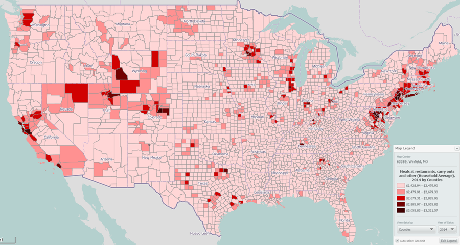
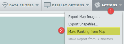
This provides a great overview, and we can see that a number of counties, mostly focused in the Northeast and West, lead the way for average household spending on dining out. We can analyze the data further by ranking these counties, using the “Make Ranking from Map” feature, which can be accessed from the Actions menu near the upper right corner of the Map panel.
Selecting, “Make Ranking from Map” yielded the following top 10 counties:
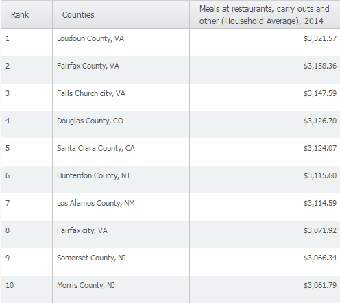
It looks like Loudoun County, VA spends the most amount of money dining out at restaurants in the United States.
Next, we wanted to view the same variable by city. Use the Analyze data by: menu at the top of the report to change the geographic unit to cities (note that you can also choose States, Zip Codes, or even Census Tracts if you want information about a specific local area).
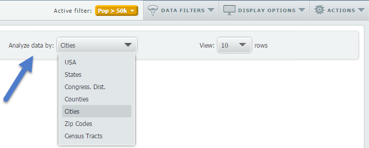
When we switched to city, and applied a data filter to only show cities with more than 50,000 residents (read more about our data filter here), we were left with the following cities:
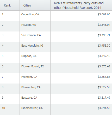
This information, combined with some additional research in SimplyMap, could be helpful in understanding dining habits in your study area, or even in siting a new business. SimplyMap combines analytical insight from reports like these with the visual impact of compelling maps in your research to help you understand, analyze, and visualize your data.
More from SimplyAnalytics


Posted on Sep 27, 2019 by Admin
Hello readers! This week we provide an in-depth response to a question asking about the legend classification methods in SimplyAnalytics. This response is now part of our Help Center: htt...
Posted on Mar 04, 2020 by Admin
Come meet the SimplyAnalytics team at the 15th annual Electronic Resources and Libraries conference, held at the AT&T Hotel & Conference Center in Austin, TX. We will be exhibitin...
Posted on Jan 27, 2015 by Admin
In this week’s report exploring SimplyMap data, we take a look at where America’s bookworms reside. To find this data, we used the variable, Reading (Household Average), 2014 found in the...
Posted on Apr 30, 2024 by Admin
Congratulations to Brandyn Whitaker as the recipient of the 2024 BRASS Student Travel Award! Brandyn is a Library Services Associate in the Workforce and Economic Development department a...
Posted on Dec 09, 2014 by Admin
In this week’s SimplyMap blog post, we set out to discover which large US cities spend the most money per year on their pets. To find this out we used the variable, “Pets, Household Avera...
Posted on Dec 19, 2016 by Admin
Stop by the Geographic Research booth [#T8] at the Ontario Library Association Super Conference to get a hands-on look at our latest and greatest SimplyMap offering. The conference will t...
Posted on Apr 05, 2019 by Admin
Come visit the SimplyAnalytics booth (325) at the upcoming ACRL 2019 show in Cleveland! Say hello, grab a chocolate, and stay for a quick demo of SimplyAnalytics. The team will be showcas...
Posted on Jul 09, 2015 by Admin
In this week’s SimplyMap report, we set out to find which cities have the highest percentages of people who use their bike as their mode of transportation to work in the US. Let’s get sta...
Posted on May 25, 2010 by Admin
We will be exhibiting at the 2010 SLA Annual Conference & INFO-EXPO June 13-15 at the Ernest N. Morial Convention Center in New Orleans, LA. Join us at booth 1537 - bring your quest...
Posted on Mar 21, 2011 by Admin
Men's Health magazine decided to crown one town America's Most Socially Networked City, and has generated quite a buzz in the process. Their survey examined the number of Facebook and Li...