


SimplyMap Tip - Editing the Map Legend
Posted on Dec 02, 2014 by Admin
Today we take a look at one of the more advanced features in SimplyMap - editing the map legend. Editing the map legend is a great way to not only customize how the data is distributed on the map, but to also change the look and feel of the map.
First, you can customize the map by changing the geographic unit shown and the variable year from the legend.
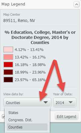
Data can be displayed by State, Congressional District, County, City, ZIP Code, Census Tract, or Census Block Group. The geographic unit can be chosen manually, or you can check the box labeled “Auto-select Geo Unit,” and SimplyMap will automatically display the most appropriate geography based on the zoom level of the map. Zooming into an area will result in increasingly smaller geographic units and present the data in greater detail.
To edit other aspects of the map legend, select “Edit Legend” at the bottom of the legend. The Legend Editor will open. The image below details this dialog, along with an explanation of what can be edited:
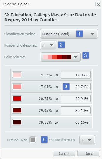
1. Classification Method: This dropdown determines how the data in your map is grouped. There are multiple methods for calculating break values for the data. You can select any of the following from the Classification Method menu:
•Quantiles (Local)
•Quantiles (National)
•Natural Breaks (Local)
•Natural Breaks (National)
•Equal Intervals
Changing from Quantiles (National) to Quantiles (Local) will reconfigure your data ranges to reflect a sample of locations from the current view, as opposed to viewing it on a national scale.
You can learn more about each of the classification methods in the FAQ.
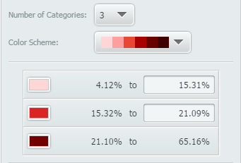
2. Number of Categories: Determines the number of data ranges you would like to see. This will also impact the number of colors you see on the map. By default, this will show 5.
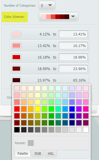
3. Color Scheme: Changes the map’s color scheme. Alternatively, if you select an individual box in the legend, you can apply your color of choice for each.
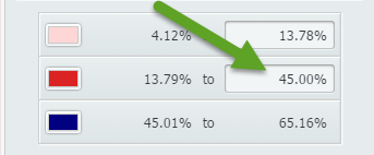
4. Data Values: Allows the user to manually enter new category break values and create custom data ranges.
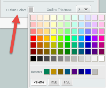
5. Outline Color/Outline Thickness: Changes the color and thickness of your map’s outline. The image below shows a map’s color outline and thickness set to a darker grey, and 2 respectively.
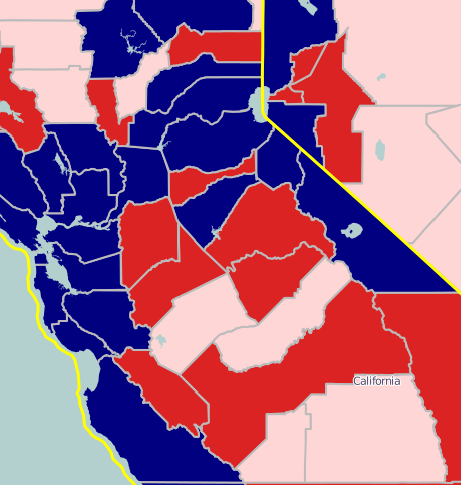
This is what the final map would look like with the edited color outline and thickness:
Stay tuned for more SimplyMap tips and tricks!
More from SimplyAnalytics
Posted on Oct 07, 2013 by Admin
Do you know the quickest way to find the name of a Block Group, Census Tract or ZIP code in our upcoming release for 3.0? The i-Tool gives you the ability to click anywhere on a map to g...
Posted on May 25, 2010 by Admin
The American Library Association 2010 Annual Conference is coming and the GRI team is gearing up for another great event this summer. We will be in Washington, D.C. again this year, June ...
Posted on Sep 10, 2010 by Admin
SimplyMap Canada is now available at several Canadian institutions, including York University and Ryerson University, in Toronto. SimplyMap Canada has all of the great features included i...
Posted on Mar 22, 2016 by Admin
Inspired by some recent support desk questions, this week’s SimplyMap report will provide some useful tips and tricks to help make the most out of your maps. Let’s get started! First, let...
Posted on Nov 06, 2014 by Admin
With over 75,000 variables in SimplyMap, you can find virtually any information you want. This week, we take a look at which U.S. locations spend the most money eating at restaurants or c...
Posted on May 15, 2015 by Admin
In this week’s SimplyMap report, we want to share with you the many options available when exporting maps in SimplyMap. In SimplyMap, when a user selects Export Map Image from the Actions...
Posted on Sep 27, 2019 by Admin
Hello readers! This week we provide an in-depth response to a question asking about the legend classification methods in SimplyAnalytics. This response is now part of our Help Center: htt...
Posted on May 06, 2016 by Admin
Visit us at booth #775 at the ALA 2016 annual conference to meet the SimplyMap team and learn more about the features and functions behind SimplyMap. Have a Ghirardelli Chocolate while we...
Posted on Jul 30, 2018 by Admin
Hello readers! Welcome to this week’s blog. This week we will feature the Related Data Table view and how you can use it to maximize your productivity in SimplyAnalytics. What is it? The ...
Posted on Nov 03, 2017 by Admin
This week we’ll talk about one of our favorite features in SimplyAnalytics - the custom combination location. This feature is a simple and effective means to create custom geographies whe...